🔧 阿川の電商水電行


前言
輪播圖是WEB應用程式中常用的UI組件之一,但並沒有一般的實現模式,考慮到可及性實現起來也很複雜,因此許多情況下會採用像是 Slick 或 Swiper 這樣的庫。
我對於能用CSS製作輪播圖感到興趣,於是決定做個備忘錄。
※ 在本文發佈時,請注意無法在 safari 和 firefox 中使用。
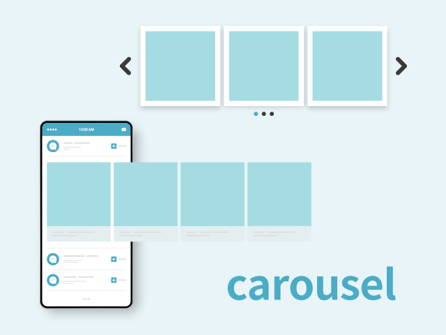
什麼是輪播圖
輪播圖是一個英文單字,意指旋轉台、轉馬、旋轉傳送帶、旋轉架等。
在網頁中,指的是可以左右移動以切換多個圖片等內容的區域。
因其旋轉的動作而被稱為輪播圖。
參考
https://digital-marketing.jp/creative/how-to-use-carousel-effectively/
製作方式
元素的理解
參考
https://developer.mozilla.org/ja/docs/Web/CSS/Reference/Selectors/::scroll-button
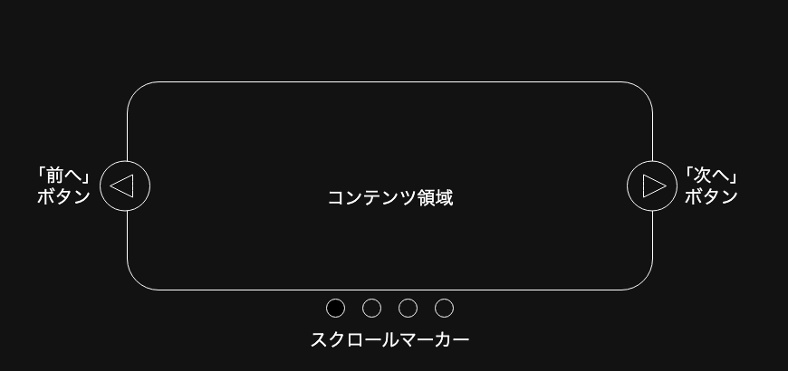
如上圖所示,輪播圖由以下幾個元素組成:
- 滑動的列表內容
- 滾動按鈕
- 下一頁、上一頁
- 輪播圖的重要功能是頁面分割,因此需要作為單獨的內容進行移動
- 滾動標記
- 顯示被點擊內容的鏈結
這些元素將透過CSS的擬似元素來表現。
實現方法
使用 ::scroll-button() 和 ::scroll-marker() 進行實現
::scroll-button()
這裡生成的滾動按鈕會在滾動容器上生成,並且可以透過CSS設定樣式。這些按鈕會像 <button> 元素一樣行為,能夠獲得焦點,並且在無法向指定方向滾動時自動禁用。禁用時會擁有 disabled 屬性,因此樣式調整也較為簡單。
.carousel::scroll-button(left) {
    content: "◀︎";
}

.carousel::scroll-button(right) {
    content: "▶︎";
}
::scroll-marker()
::scroll-marker-group 用於分組,並作為滾動容器內元素的標記,以便透過CSS調整樣式。它的行為像是一個錨點鏈結,並且可以透過點擊移動到指定的內容。
.carousel::scroll-marker {
    content: "";
    border: 1px solid #444;
    border-radius: 50%;
}
當搭配使用 :target-current 擬似類時,可以調整活動標記的樣式。
.carousel::scroll-marker:target-current {
    background-color: #444;
}
滑順移動並穩定停止
scroll-snap-type: x mandatory; 可以讓元素在橫向上滾動,並能夠進行嚴格的調整,確保有一個元素顯示出來。
透過 scroll-snap-align: center; 可以調整基準線的停止位置,在這裡調整為在中央停止。
.content {
    scroll-behavior: smooth;
    scroll-snap-type: x mandatory;
}

li {
    scroll-snap-align: center;
}
參考
https://www.webcreatorbox.com/blog/scroll-snap
接下來,我們來製作一個簡單的輪播圖。
<div class="carousel">
    <ul class="content">
        <li></li>
        <li></li>
        <li></li>
        <li></li>
        <li></li>
        <li></li>
        <li></li>
        <li></li>
        <li></li>
        <li></li>
    </ul>
</div>
.carousel {
position: relative;
block-size: 400px;
}
.content {
display: grid;
grid-auto-columns: 100%;
grid-auto-flow: column;
place-items: center;
overflow-x: auto;
scroll-snap-type: x mandatory;
height: 100%;
scroll-behavior: smooth;
scroll-marker-group: after;
&::scroll-button(right) {
position: absolute;
top: 45%;
right: 20px;
content: "▶︎";
}
&::scroll-button(left) {
position: absolute;
top: 45%;
left: 20px;
content: "◀︎";
}
&::scroll-button(*) {
width: 44px;
height: 44px;
border-radius: 50%;
color: #444;
border: 1px solid #444;
}
&::scroll-button(*):hover {
background-color: #999;
color: #444;
cursor: pointer;
}
&::scroll-button(*):disabled {
opacity: 0.3;
cursor: not-allowed;
background-color: #eee;
}
&::scroll-marker-group {
display: flex;
justify-content: center;
margin-top: 10px;
gap: 10px;
}
}
.content::-webkit-scrollbar {
display: none;
}
li {
list-style: none;
scroll-snap-align: center;
background-color: black;
height: 350px;
width: 350px;
&::scroll-marker {
content: "";
border: 1px solid #444;
width: 20px;
height: 20px;
border-radius: 50%;
}
&::scroll-marker:target-current {
background-color: #444;
}
}示範

最後
在當前階段(2026年1月)來說,這仍然是實驗性的,但單純使用CSS來表現的確是相當便利。我相信隨著其他瀏覽器的支援,這將變得更易於使用,因此我認為可以將其作為一個值得留意的選項。
原文出處:https://qiita.com/kobayashimakoto/items/9e6595d7c6f6f0c90c4c
1) --- 會變成分隔線(上一行必須是空白)
2) # 會變成一級標題
3) ## 會變成二級標題
4) ### 會變成三級標題
5) **粗體文字**會顯示粗體文字
6) ```當第一行與最後一行會顯示程式碼
7) 請搜尋 Markdown 語法,了解各種格式