

AI圖片生成的「AI感」消除用畫風提示詞集(38種風格+範本)
用 ChatGPT(GPT Image)做資料或網站用插圖時,常常會卡在同一個地方。
線條太過一致、漸層太平滑、臉部太過工整、背景裡還會莫名多出一些毫無意義的小物件。簡單來說,有時候一眼就看得出來是 AI 生成的圖片。
所以我做了 38 種只要接在日文指示句後面就能固定畫風的提示詞,並且全部用同一個題目實際生成後排在一起比較。哪些有效事前並不知道,因此我是實際逐一測試的。也一併整理了用來「降低 AI 感」的附加區塊,以及可以直接拿來用的完成版範本。
內容以複製貼上為前提設計,所以你只要把有興趣的畫風程式碼區塊拿去用就夠了。
基本的使用方式
做法只有兩個步驟。
- 先用日文寫出想畫的內容
- 接在後面貼上這篇文章中選擇的提示詞
為了統一,我沒有加太細的指示,而是反覆使用「請畫一位日本少女」。
接著在這後面加入 STYLE 提示詞。以下所有生成範例都是用同一題目做的,方便你只比較畫風差異。
把 STYLE 提示詞寫成英文,是因為表現畫風的詞彙(linework、halftone、registration 等)通常用英文比較容易有效。內容用日文、畫風用英文,這個組合目前最穩定。
手繪・類比畫材系
01. 自然的手繪插畫
STYLE:
natural hand-drawn illustration, imperfect organic linework, subtle variations in line thickness, slightly uneven contours, loose human-made strokes, simplified shapes, restrained details, soft matte colors, subtle paper texture, minimal digital polish, gentle imperfections, natural spacing, understated composition, handcrafted visual character ![style-02-loose-hand-drawn.png]
很適合作為想避開 AI 圖片特有「線條太一致」時的基準。
02. 隨性手繪
STYLE:
loose hand-drawn illustration, casual sketch-like lines, spontaneous strokes, imperfect proportions, slightly irregular shapes, visible construction-like marks, simple coloring, relaxed composition, human drawing imperfections, understated details, natural visual rhythm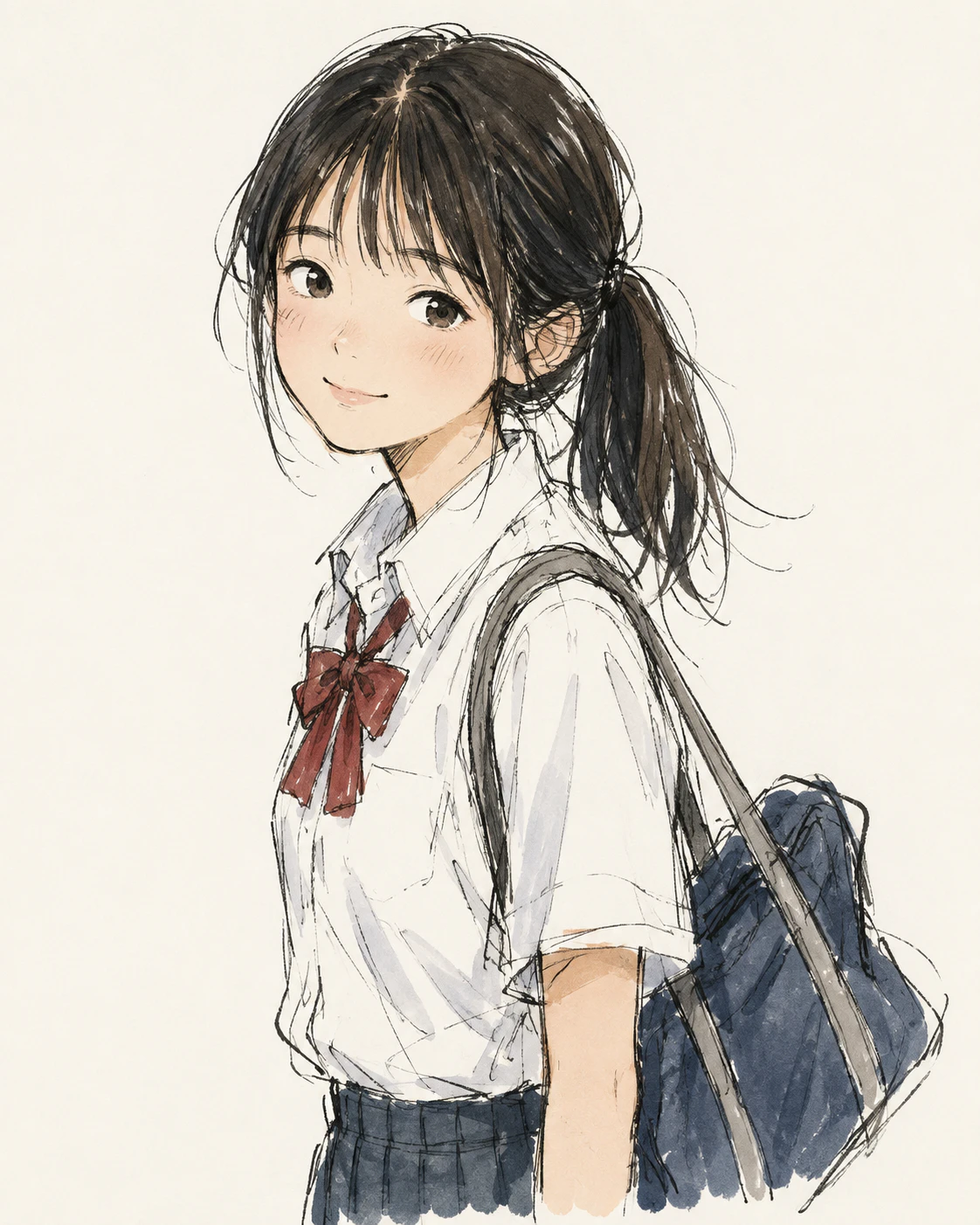 比 01 更加鬆散的畫風。適合想要不那麼精緻、帶點動勢的圖。
03. 鉛筆插畫
STYLE:
traditional pencil illustration, visible graphite strokes, soft pencil shading, varied pencil pressure, slightly rough linework, subtle smudging, natural paper grain, imperfect hand-drawn edges, restrained contrast, authentic sketchbook quality 適合想做成黑白、氣氛沉穩的時候使用。因為會帶出擦痕與暈染,所以即使放進資料插圖也不太容易突兀。
04. 色鉛筆
STYLE:
colored pencil illustration on textured paper, visible pencil strokes, layered pigment, uneven hand pressure, slightly imperfect coloring, subtle white paper showing through, soft edges, muted natural colors, handmade children's book quality 重點是要讓白色紙面露出來。這樣就會減弱那種數位上色過於均勻的感覺,讓畫面多一點溫度。
05. 蠟筆
STYLE:
hand-drawn crayon illustration, visible wax texture, uneven coloring, rough organic edges, overlapping crayon strokes, playful simplified shapes, warm limited color palette, imperfect childlike marks, tactile paper surface 很適合用在兒童告示、通知單等需要親和感的用途。
06. 水彩
STYLE:
traditional watercolor illustration, translucent washes, gentle pigment bleeding, uneven watercolor edges, subtle paper texture, soft overlapping colors, restrained highlights, loose brushwork, organic color variations, handmade editorial illustration 因為有暈染與紙質感,AI 特有的那種滑溜感會自然變淡。
明明沒指定,還自己開始吟唱「春天,曙光」。
07. 水彩+鋼筆
STYLE:
hand-drawn ink and watercolor illustration, loose irregular ink outlines, varied line weight, transparent watercolor washes, subtle pigment bleeding, textured watercolor paper, slightly imperfect registration between line and color, understated handmade finish
因為加了線條與顏色稍微錯位的指定,所以會非常接近「人類畫出來的書本插圖」。在本文裡也是效果最容易看出來的畫風之一。
08. 繪本
STYLE:
warm children's book illustration, hand-drawn organic shapes, slightly imperfect outlines, simple expressive characters, soft textured colors, subtle paper grain, gentle visual storytelling, restrained detail, charming handmade quality, traditional picture-book feeling
會偏向海外繪本的氛圍。角色表情也比較容易簡化地收斂起來。
09. 日本兒童書插畫風
STYLE:
gentle Japanese children's book illustration, clean but slightly irregular hand-drawn lines, soft restrained colors, simplified facial features, friendly proportions, minimal shading, quiet composition, subtle paper-like texture, warm everyday atmosphere
比 08 更工整,色彩數量也更克制。想要靠近日本兒童書常見調性時很好用。
扁平・編輯風格系
10. 簡潔扁平設計
STYLE:
clean flat illustration, simple geometric shapes, limited color palette, minimal shading, clear silhouettes, balanced negative space, restrained visual details, subtle asymmetry, friendly editorial design, simple vector-like forms without excessive polish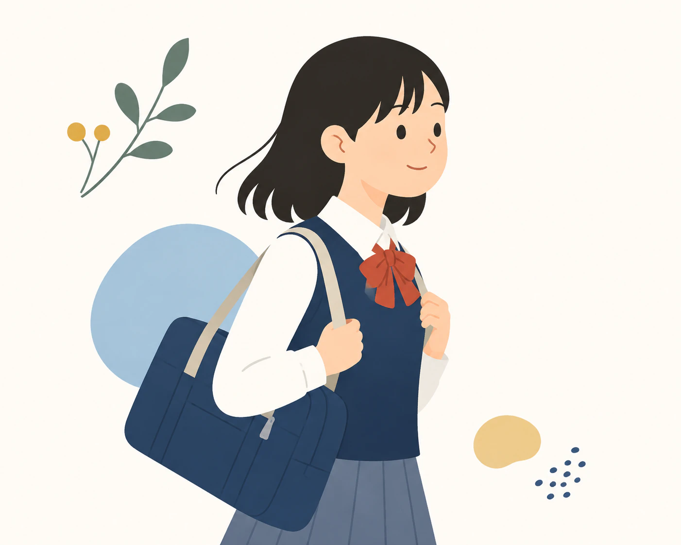
就是一般常見的扁平插畫。不過只靠這個指定很容易變成光滑得很像 AI 的圖,所以也建議一起試試下一個 11。
11. AI感較弱的扁平設計
flat illustration 單獨使用時很容易變成 AI 特有的光滑向量插畫,所以我故意加入了一些「刻意不完美」的設定。
STYLE:
human-designed flat illustration, simple geometric forms with subtle irregularities, slightly imperfect curves, restrained color palette, minimal shading, intentional asymmetry, varied proportions, natural spacing, subtle print-like texture, editorial graphic design, avoid overly polished vector aesthetics
intentional asymmetry(刻意的不對稱)和 subtle print-like texture(些微印刷質感)這兩個設定很有效。跟 10 放在一起看,差異會非常明顯。
12. 極簡扁平
STYLE:
minimal editorial flat illustration, very simple shapes, limited three-to-five-color palette, large areas of negative space, minimal facial details, clean silhouettes, restrained composition, subtle handmade irregularities, quiet contemporary graphic design
這類是用色數與留白數字化地限制住。因為不容易塞太多資訊,也很適合投影片的標題頁。
13. 雜誌插圖
STYLE:
contemporary editorial illustration, conceptual simplified forms, expressive proportions, limited sophisticated color palette, bold negative space, subtle texture, slightly imperfect geometric shapes, intelligent visual simplicity, modern magazine illustration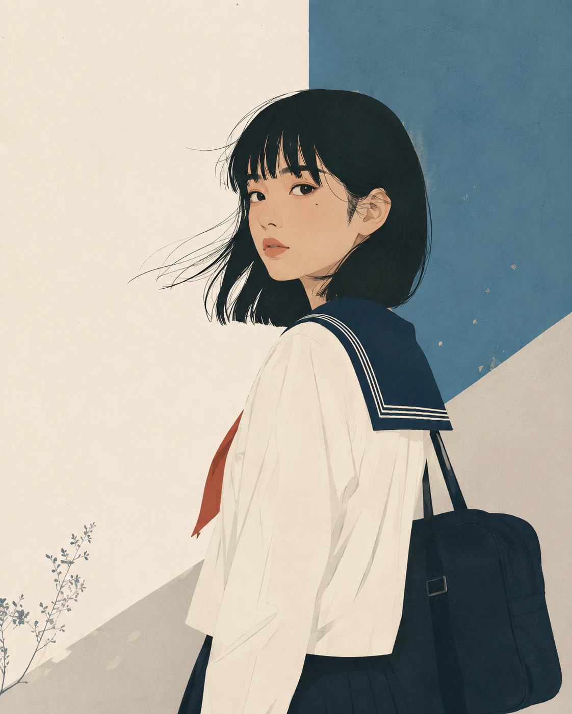
稍微偏大人感的畫風。抽象度也會再高一點,所以很適合概念性內容或說明用插圖。
14. Web 服務用插畫
STYLE:
modern web editorial illustration, friendly simplified characters, clean geometric shapes, restrained palette, minimal shading, subtle organic imperfections, approachable proportions, clear visual hierarchy, generous negative space, professional but not overly polished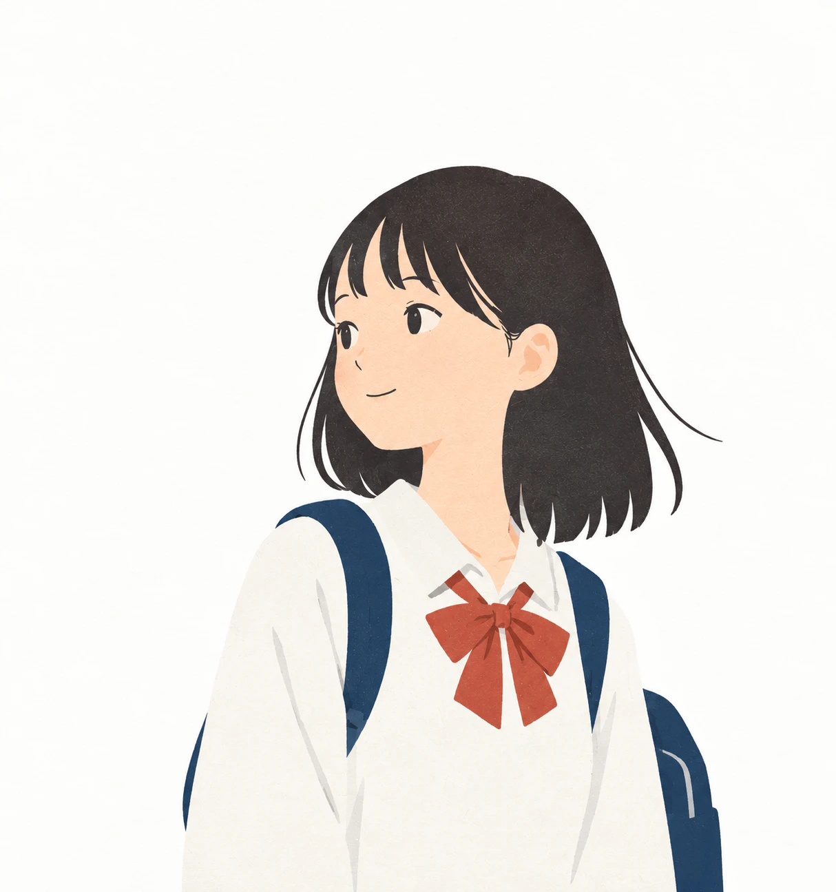
適合 LP 或服務介紹頁。目標是抓到「看起來正式,但不會做得太滿」的平衡。
15. 新創風 Web 插畫
STYLE:
modern product illustration, simplified human characters, abstract geometric forms, restrained contemporary palette, minimal gradients, clean composition, subtle organic line variation, friendly professional appearance, editorial rather than stock-art aesthetics
最後的 editorial rather than stock-art aesthetics 是為了避免那種常見的免費素材感。
可愛・角色系
16. 活潑手繪
STYLE:
playful hand-drawn graphic illustration, bold irregular outlines, simplified chunky shapes, bright limited colors, intentionally imperfect proportions, energetic handmade strokes, subtle screen-print texture, casual contemporary visual language
線條較粗,整體印象會很有活力。適合活動宣傳、橫幅等想要更醒目的用途。
看太多 AI 圖之後,已經搞不清楚什麼才算不像 AI 了。
17. 療癒風插畫
STYLE:
loose friendly doodle illustration, simple rounded characters, uneven hand-drawn outlines, minimal facial features, slightly awkward charming proportions, flat muted colors, lots of empty space, casual human-made feeling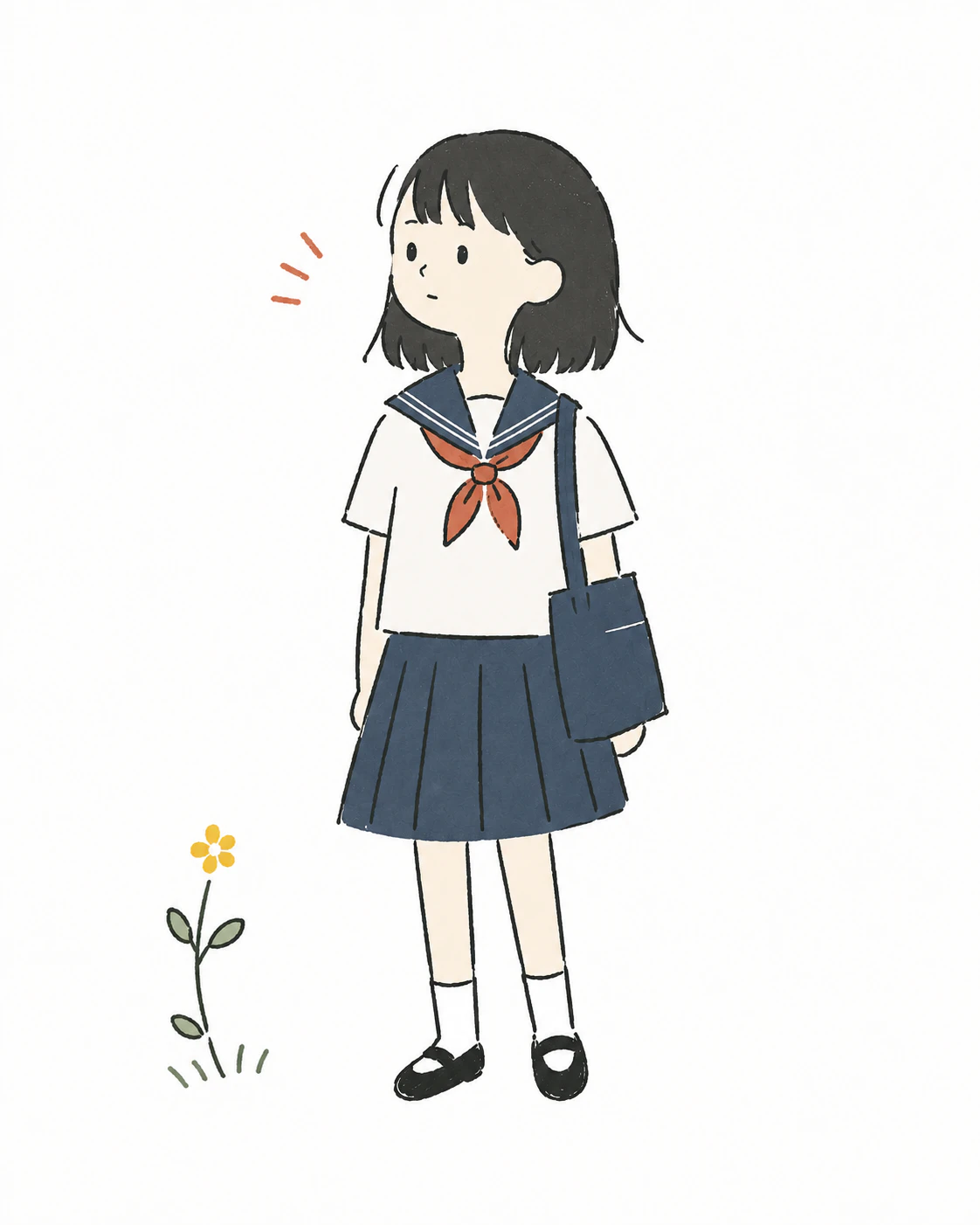
slightly awkward charming proportions(有點笨拙但可愛的比例)就是這個畫風的核心。
18. 塗鴉・塗鴉風
STYLE:
casual doodle illustration, spontaneous pen strokes, uneven line weight, quirky simplified shapes, sparse details, playful visual symbols, imperfect spacing, monochrome or limited colors, authentic notebook drawing quality
像是畫在筆記本邊角的塗鴉。當作圖解的附屬元素時,可以讓整體感覺輕鬆一點。
19. 粗線條角色
STYLE:
bold hand-drawn character illustration, thick irregular outlines, rounded simplified shapes, minimal facial features, solid flat colors, playful proportions, subtle line wobble, strong readable silhouette, screen-printed handmade character design
就算縮得很小也不容易崩掉,所以也很適合拿來做圖示或貼紙。
印刷・版畫系
這個分類對於消除 AI 感特別有效。因為像是墨色位移、刷痕、紙張紋理這些「物理上的不完美」,會直接表現在畫面上。
20. 復古印刷
STYLE:
vintage printed illustration, limited ink palette, imperfect print registration, subtle halftone texture, slightly faded colors, rough paper grain, simple graphic shapes, uneven ink coverage, mid-century editorial character
因為有網點和褪色感,所以會變成像老印刷品一樣的質地。
21. 絲網印刷
STYLE:
screen-print illustration, limited spot colors, slightly imperfect ink registration, bold simplified forms, textured ink coverage, rough paper surface, strong graphic silhouettes, handmade printmaking character
這是偏重「面」的畫風。因為色數被壓低,所以雖然簡單,但力量感很強。
22. Risograph 印刷
STYLE:
risograph-style illustration, limited ink colors, visible grain, imperfect color registration, slightly uneven ink density, bold simple shapes, textured paper, playful graphic composition, authentic small-press print character
手感雖然消失了,但 AI 感應該也薄很多。
23. 版畫
STYLE:
hand-carved printmaking illustration, rough carved lines, irregular ink edges, simplified bold shapes, visible print texture, uneven ink coverage, limited colors, handmade relief-print character
因為會出現雕刻痕跡,所以線條自然就會有點顆粒與顛簸。重點就是要做出這種不均勻感。
24. 木版畫
STYLE:
traditional woodblock-inspired illustration, carved organic outlines, flattened perspective, limited natural colors, visible paper and ink texture, simplified forms, restrained shading, subtle printing imperfections
加入 flattened perspective(平面化透視)後,會刻意把空間深度壓扁。
構圖又開始重複了,明明應該有指示要重置的,但還是一路生成下去了。
25. 墨線畫
STYLE:
expressive ink illustration, varied brush pressure, broken irregular lines, occasional dry-brush texture, organic silhouettes, restrained detail, strong negative space, handmade paper texture, spontaneous human brushwork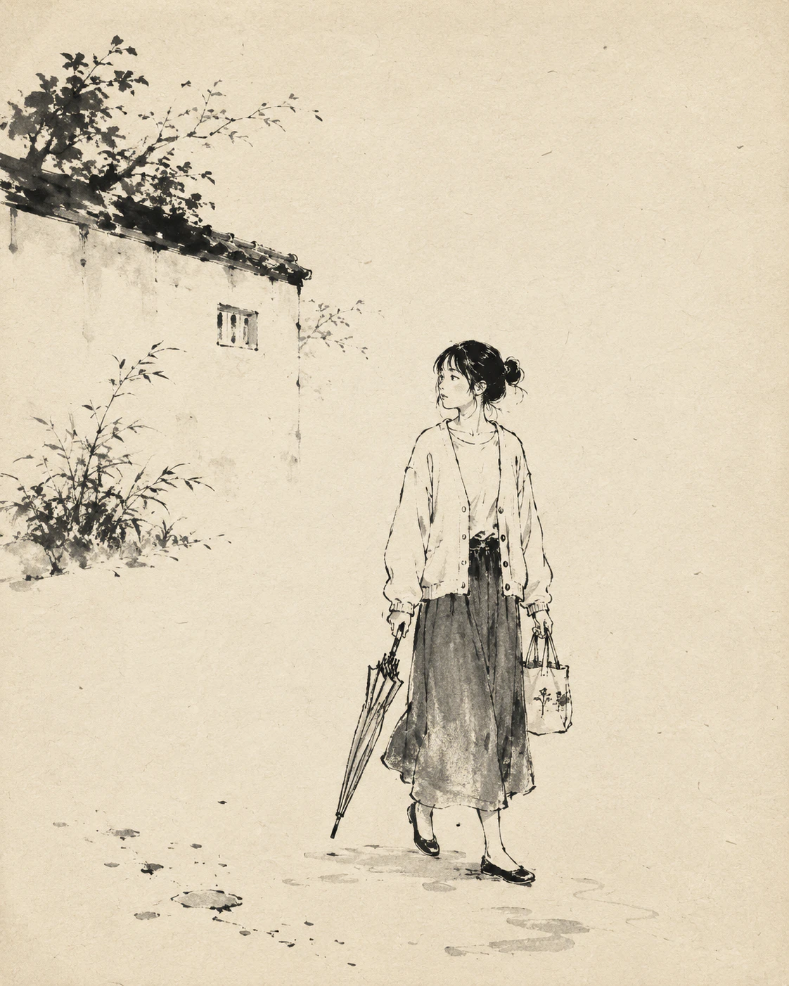
會出現筆觸的起收與乾刷效果。適合想利用留白來構圖的時候。
因為構圖又撞到了,所以我已經完全重置了。
26. 麥克筆
STYLE:
hand-rendered marker illustration, visible marker strokes, overlapping translucent areas, slightly uneven fills, bold simplified shapes, loose outlines, sketchbook presentation style, natural paper texture
重疊區域會變深,這就是麥克筆的感覺。會變成像提案草圖那種比較隨性的氛圍。
27. 粉彩
STYLE:
soft pastel illustration, visible chalk texture, powdery blended colors, irregular edges, textured paper, gentle color transitions, loose hand-drawn shapes, restrained fine detail, tactile handmade quality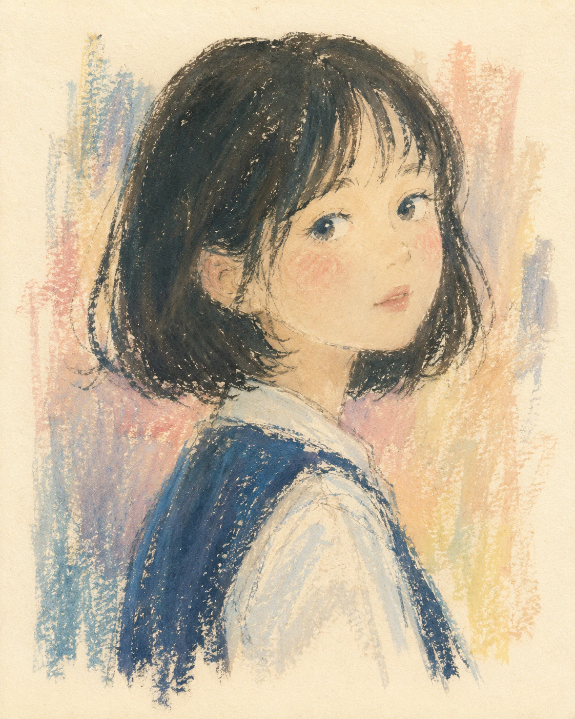
因為會有粉感質地,所以輪廓會變得比較柔和。
28. 剪紙
STYLE:
hand-cut paper collage illustration, simple layered paper shapes, slightly irregular cut edges, subtle paper fibers, flat colors, minimal shading, handmade composition, tactile craft aesthetic
是像把紙剪下來再疊起來的表現方式。因為形狀會變得更簡單,所以畫面不容易塞太多資訊。
29. 紙拼貼
STYLE:
mixed paper collage illustration, torn and hand-cut paper edges, layered colored paper textures, subtle shadows between layers, imperfect handmade shapes, limited palette, playful editorial composition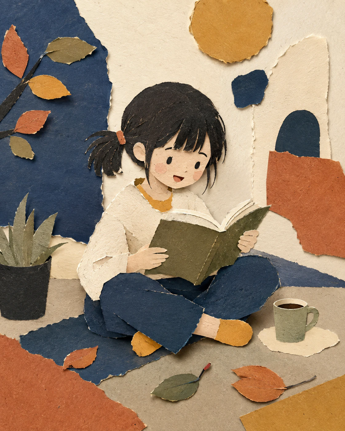
等於是在 28 的基礎上加上「撕邊」和「層次陰影」。看起來會更像手工勞作。
漫畫・遊戲系
30. 漫畫
STYLE:
hand-drawn manga illustration, expressive black ink linework, varied pen pressure, screentone shading, simplified background details, energetic natural strokes, subtle imperfections in linework, authentic printed comic texture
包含網點效果的漫畫畫風。明確寫出筆壓變化是重點。
31. 漫畫・較鬆的版本
STYLE:
simple hand-drawn manga illustration, loose black ink outlines, minimal screentone, expressive simplified faces, slightly exaggerated poses, sparse background, casual serialized-comic drawing quality
比 30 更少線條,背景也省略得更多。適合四格漫畫或說明漫畫這類輕量用途。
32. 獨立遊戲風 2D
STYLE:
independent 2D game illustration, stylized simplified characters, hand-drawn outlines, limited atmospheric palette, subtle texture, distinctive imperfect shapes, restrained detail, handcrafted visual identity
色彩比較容易形成統一感,所以即使多張並排,也比較好維持世界觀一致。
實務・教材系
33. 接近圖示・圖標的版本
STYLE:
simple pictographic illustration, bold readable silhouettes, minimal geometric forms, very limited colors, no unnecessary detail, clear spacing, subtle handmade irregularity, functional editorial icon design
很適合拿來當說明圖的元素。裝飾不會太多,也比較容易整理資訊。
34. 教材用
STYLE:
clear educational illustration, friendly simplified characters, easy-to-read shapes, restrained colors, minimal visual clutter, clear action and body language, subtle hand-drawn quality, accessible textbook illustration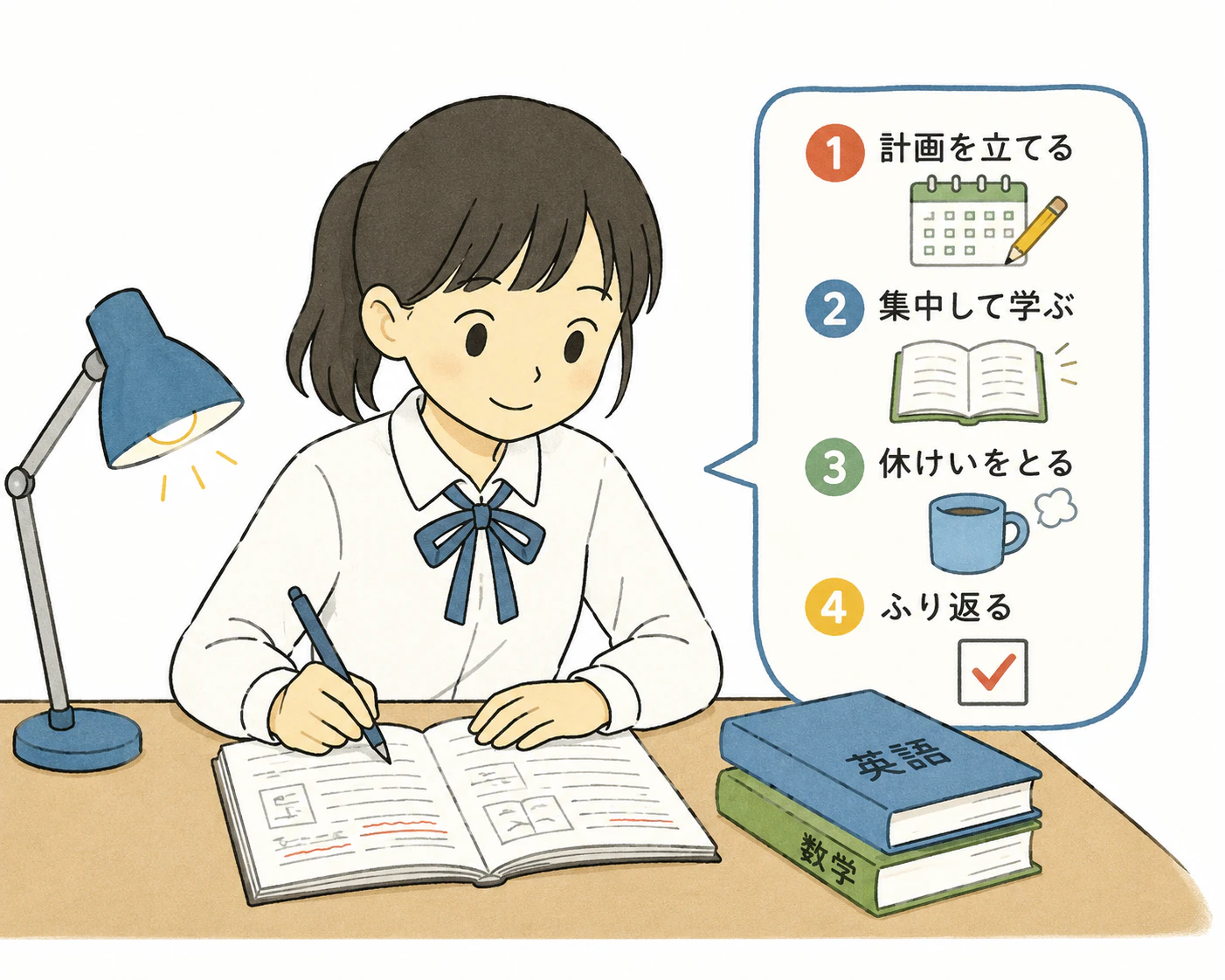
這種指示的重點在於讓人看得出「這是什麼情境」。很適合講義、配布資料等以易懂為優先的場合。
35. 教科書插圖
STYLE:
Japanese textbook-style educational illustration, clean simplified figures, restrained realistic proportions, clear gestures, minimal shading, soft neutral colors, uncluttered background, practical instructional composition
比 34 更接近真實比例。會更像日本教科書裡常見的調性。
36. 單線畫風
STYLE:
continuous-line drawing, loose flowing ink stroke, spontaneous hand movement, irregular curves, minimal details, expressive simplified forms, abundant negative space, authentic pen-on-paper quality
是用一條線表現的畫風。比起傳達資訊,更適合裝飾用途。
37. 原子筆
STYLE:
ballpoint pen illustration, visible pressure variation, thin scratchy lines, repeated sketch strokes, subtle cross-hatching, imperfect contours, plain paper texture, casual notebook drawing aesthetic
因為會留下重疊筆觸,所以會很像畫在手帳裡的速寫。
38. 時尚插畫
STYLE:
hand-drawn fashion illustration, elongated expressive figures, loose confident linework, selective watercolor or marker washes, unfinished edges, large negative space, elegant spontaneous drawing quality
會有較高的頭身比例,並且特徵是只在部分區域上色。
[](#看太多-ai-圖之後會陷入不知道什麼才不像-ai 的狀態)看太多 AI 圖之後,會陷入不知道什麼才不像 AI 的狀態。
看著看著,最後會變成到底要不要就這樣用,做決定的終究還是人類。
我想大概就是這麼回事。
用來削弱「AI感」的附加區塊
這些是加在前面各種 STYLE 後面使用的附加內容。因為有分成不同目的,所以只要貼上會對應症狀的那一段就夠了。
保留手作感
加在你喜歡的 STYLE 最後面。這一組很泛用,基本上第一個先記住這個就可以。
HUMAN-MADE CHARACTER:
preserve natural imperfections, subtle asymmetry, irregular line pressure, varied spacing, slightly imperfect curves, restrained detail, natural shape variation, handmade texture, understated visual decisions, avoid excessive visual perfection
避免滑順的 AI 插畫
把太過平滑的向量曲線、光澤、像塑膠一樣的表面,直接點名禁止。
Avoid overly smooth vector curves, glossy gradients, excessive rim lighting, plastic-looking surfaces, hyper-clean outlines, perfectly symmetrical faces, excessive tiny details, generic stock-illustration aesthetics, overly polished digital rendering.避免資訊塞太滿
AI 圖如果不加限制,畫面裡的東西會一直增加。明確要求留白其實很有效。
Keep the composition simple and intentional. Use only necessary objects. Leave generous negative space. Avoid decorative clutter, unnecessary background objects, excessive accessories, random visual symbols, and over-detailed environments.讓人物更自然
禁止不自然的笑容和像模特兒一樣的姿勢。
Characters should have natural relaxed poses, subtle asymmetry, believable body language, simple expressive gestures, understated facial expressions, and slightly varied proportions. Avoid mannequin-like posing and exaggerated artificial smiles.讓兒童插畫更自然
畫小孩時常常會讓比例和表情過頭,所以要另外加上兒童專用設定。
Children should have age-appropriate proportions, simple natural expressions, casual body language, slightly imperfect clothing folds, ordinary hairstyles, and believable everyday poses. Keep facial details simple.讓背景不要很 AI
可以避免同樣的物件不自然地重複,或是乍看合理、仔細看卻不成立的建築。
Use a simple believable background with only a few meaningful objects. Avoid repetitive objects, impossible architecture, decorative clutter, excessive depth, and random background details.讓顏色不要很 AI
用來抑制飽和度過高、整體變成彩虹色的情況。
Use a restrained limited color palette, slightly muted colors, natural color relationships, subtle variations within flat areas, and avoid overly saturated rainbow-like color combinations.可直接使用的完成版範本
接下來是把上面的 STYLE 與附加區塊組合成一條完整提示詞的版本。如果用途已經確定,直接複製這些會比較快。
通用範本
不知道要選哪個時就用這個。存起來後,幾乎各種場景都能用。
[在這裡寫你希望用日文描述的內容]

VISUAL STYLE:
hand-drawn editorial illustration, organic irregular linework, subtle variations in line thickness, simplified shapes, slightly imperfect proportions, restrained details, soft matte colors, limited harmonious color palette, subtle paper and print texture, intentional asymmetry, natural spacing, generous negative space.

HUMAN-MADE CHARACTER:
preserve small drawing imperfections, uneven line pressure, slightly irregular curves, subtle shape variations, natural visual rhythm, understated design decisions, handmade texture.

COMPOSITION:
simple clear composition, one obvious visual focus, only necessary objects, believable spatial relationships, uncluttered background.

AVOID:
overly smooth vector curves, glossy gradients, plastic-looking surfaces, excessive rim lighting, hyper-detailed rendering, perfectly symmetrical faces, generic stock illustration aesthetics, excessive decorative elements, unnecessary background objects, artificial posing, overly polished digital appearance.
我把它設成 VISUAL STYLE / HUMAN-MADE CHARACTER / COMPOSITION / AVOID 這四個區塊。替換內容時,如果以區塊為單位替換,比較不容易跑掉。
手繪繪本向
[在這裡寫你希望用日文描述的內容]

Create the image as a warm hand-drawn children's book illustration.

Use loose organic outlines with subtle variations in thickness and pressure. Shapes should feel slightly irregular and naturally hand-drawn rather than geometrically perfect. Use simplified expressive characters, soft matte colors, a restrained harmonious palette, subtle paper grain, and occasional visible drawing or coloring texture.

Keep the composition calm and uncluttered, with generous empty space and only a few meaningful background elements. Facial expressions should be simple and natural.

Preserve subtle asymmetry, irregular curves, slight differences between repeated objects, and human drawing imperfections.

Avoid glossy digital rendering, smooth vector-like curves, strong gradients, excessive lighting effects, excessive details, perfectly symmetrical faces, generic stock illustration aesthetics, plastic-looking surfaces, and overly polished AI-generated appearance.
這裡不是用條列式,而是用散文寫法。因為有些情況下,長文提示反而更容易有效,所以兩種寫法都保留了。
扁平設計向
[在這裡寫你希望用日文描述的內容]

Create a human-designed editorial flat illustration.

Use simple geometric shapes with subtle organic irregularities, slightly imperfect curves, simplified human figures, a restrained four-to-six-color palette, minimal shading, clear silhouettes, intentional asymmetry, and generous negative space.

Keep the forms simple and graphic. Introduce subtle variations in proportions and spacing so repeated elements do not appear mechanically identical. Add a very subtle print-like texture.

Avoid glossy gradients, 3D effects, excessive shadows, perfectly smooth vector geometry, excessive decorative elements, generic corporate stock illustration aesthetics, and overly polished AI-generated appearance.
重點是加入「讓重複元素看起來不要機械式完全一致」這句。扁平風格的 AI 感,通常就是從這裡冒出來的。
療癒手繪向
[在這裡寫你希望用日文描述的內容]

Create a loose casual hand-drawn illustration.

Use simple rounded shapes, slightly wobbly outlines, uneven line thickness, minimal facial details, relaxed proportions, flat muted colors, and plenty of empty space. The drawing should feel spontaneous and charmingly imperfect, similar to an illustrator quickly drawing with a pen in a sketchbook.

Allow minor asymmetry, irregular curves, inconsistent spacing, and subtle differences between similar shapes.

Avoid perfect geometry, smooth vector lines, realistic rendering, glossy surfaces, complex lighting, excessive details, and overly polished digital aesthetics.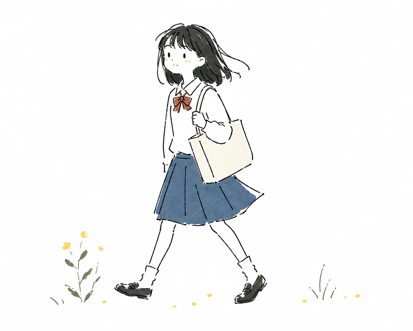
只要加一句比喻成「像是在筆記本上用筆快速畫出來的感覺」,目的就會更容易傳達。
Risograph 印刷向
[在這裡寫你希望用日文描述的內容]

Create a handmade risograph-style editorial illustration.

Use bold simplified shapes, a limited two-to-four ink color palette, visible paper grain, subtle ink noise, imperfect color registration, slightly uneven ink density, irregular handmade edges, and simplified expressive characters.

Use large graphic areas and generous negative space. Keep details deliberately sparse.

Avoid smooth gradients, photographic realism, glossy surfaces, precise vector geometry, excessive fine detail, perfect color alignment, and polished digital rendering.
把墨色限制在 2~4 色這個設定非常有效。如果目標是消除 AI 感,我會建議先從這個開始試。
水彩繪本向
[在這裡寫你希望用日文描述的內容]

Create a traditional watercolor children's book illustration.

Use loose pencil or ink outlines combined with transparent watercolor washes. Allow subtle pigment bleeding, uneven painted edges, visible watercolor paper grain, slight variations in color density, and areas where the white paper remains visible.

Keep characters simplified and expressive. Use a gentle restrained palette and a quiet uncluttered composition.

Avoid digital airbrushing, perfectly smooth gradients, glossy highlights, sharp vector edges, excessive realism, hyper-detailed rendering, and overly polished AI-generated appearance.
「讓白色紙面保留下來」這個設定,幾乎就決定了水彩感。
總結
把 38 種風格排在一起之後,我發現對消除 AI 感最有效的是這 4 件事。
- 直接要求不完美 — 像
slightly irregular、uneven line pressure、intentional asymmetry這類詞,用來明確表示「不要畫得太完美」。 - 借用物理質感 — 加入紙張紋理、墨色偏移、網點等。Risograph 和版畫系之所以強,就是因為這個原因。
- 用數字限制留白與色數 — 像
limited three-to-five-color palette、generous negative space這樣直接限制。放著不管,物件和色彩通常都會越來越多。 - 寫出禁止項目 — 用
AVOID區塊先處理掉光澤漸層、左右完全對稱的臉等問題。
反過來說,只有 hand-drawn 或 illustration 這種詞是不夠的。這兩個詞很容易只把畫面拉回 AI 心中「常見插畫」的平均值,所以如果不把「要怎麼崩壞」寫清楚,最後還是會回到那種滑順的圖。
已經整理成可以直接貼上的形式了,建議你先挑一個喜歡的畫風,接到日文指示後面試試看。
我也有個人開發 App。
原文出處:https://qiita.com/maeda-niku18/items/b633dda178c505461080
1) --- 會變成分隔線(上一行必須是空白)
2) # 會變成一級標題
3) ## 會變成二級標題
4) ### 會變成三級標題
5) **粗體文字**會顯示粗體文字
6) ```當第一行與最後一行會顯示程式碼
7) 請搜尋 Markdown 語法,了解各種格式

